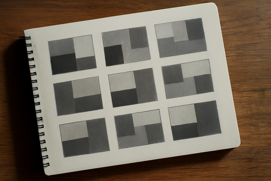
Thumbnail Value Studies: Weight, Scale, and Visual Balance
Value as a primary organiser
Value refers to the relative lightness or darkness of a mark. In thumbnails, value is often the fastest way to test visual weight and balance. A single dark mass can anchor a page, while a series of mid-tone shapes can create rhythm. Practising value relationships at thumbnail size sharpens your sense of where to place light and dark in larger work.
Three-value method
Limit yourself to three tones: light, middle, and dark. This restriction simplifies decisions and makes visual relationships obvious. Use a pencil for mid-tones, a softer tool or marker for darks, and leave paper white for lights.
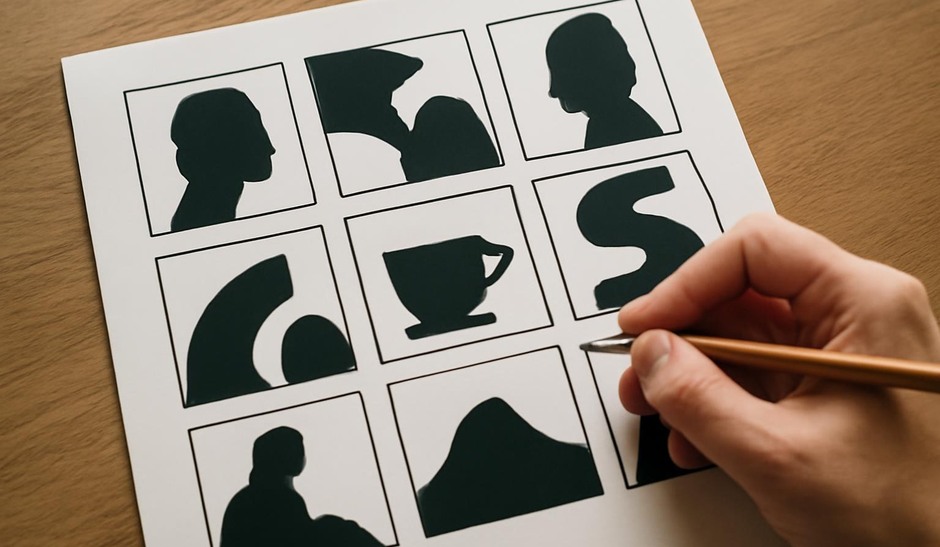
- Dark — strongest visual weight; use sparingly for anchors.
- Mid — main body of form; flexible and connective.
- Light — relief and breathing space; can function as a focal highlight when placed carefully.
Value blocking exercise
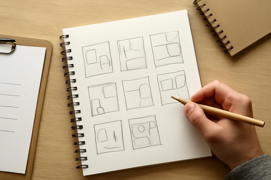
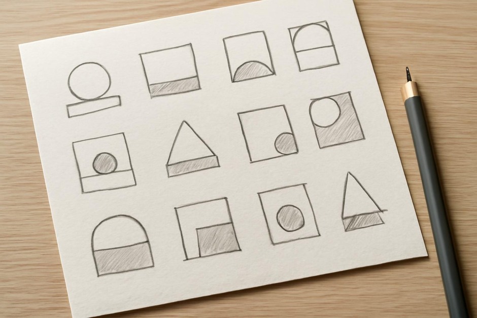
Materials: sketchbook, 2B or 4B pencil and a marker or dark wash if available. Draw a grid of small thumbnails and assign each a different value arrangement.
- Create 8–12 thumbnails using only three tones.
- In each thumbnail, decide quickly which area will be dark, which mid, and which light.
- Try variations: dark as a single anchor, dark distributed into several small marks, dark balanced by large light areas.
- Note how scale and placement of values shift perceived weight.
Checklist
- Limit studies to three values.
- Test both single-anchor and distributed-dark arrangements.
- Vary scale of value areas to test weight changes.
- Use quick notations to mark successful value placements.
- Compare how different value patterns affect focal priority.
Reflection prompts
- Which thumbnails used dark value most effectively as an anchor?
- Did distributed dark spots create more visual interest than a single large dark mass?
- Where did mid-tones act as essential bridges between light and dark?
- Which arrangement would you keep if scaling the thumbnail up to a larger sketch?
Value studies are a compact way to test balance before investing time in detail. By restricting tonal options and moving quickly, you learn which arrangements carry weight and which read as muddy or indecisive. Over time, these habits make tonal decisions more instinctive and help you plan stronger compositions from the thumbnail stage onward.